* every time you present with a screen.
Don’t get me wrong; of course, I’m a great PowerPoint fan. During my 3,013 days as a business consultant at one of the Big4 I didn’t speak English. I didn’t speak German either. Neither Spanish. No, for eight years and three months I spoke PowerPoint.
The business world speaks PowerPoint today! Since the late 90s PowerPoint has replaced Word as the leading tool to write, report and present in the business world. Fancy graphs, management circles, bullet points – here comes the PowerPoint sun!
But – where there’s light, there’s shadow.
Your corporate PowerPoint template is that shadow. Your corporate PowerPoint template works wonderfully when you produce a handout presentation to be discussed during a meeting where all participants sit at a table. Everyone flips through the pages, takes notes. In this situation your standard slides work just fine.
But – what about a keynote presentation at a prestigious conference? What about the strategy presentation in front of your 53 colleagues? What about presenting with a 6×4 meter screen?
You create one PowerPoint slide deck and throw it at the wall. PowerPoint replaces your speech. You and your charisma surrender to soulless slides. Boredom, dullness, death by PowerPoint is the unavoidable consequence.
In this article I won’t talk about what I think a screen presentation should look like. In this article I offer you five common sense reasons why corporate PowerPoint template-based presentations will never work well with a screen.
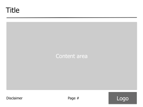
The image below shows the typical design of a corporate PowerPoint template – title, content area, some form of disclaimer, page number and, of course, your company’s logo.

This standard design has five big disadvantages when you throw those slides at a wall.
Space limitation
In Europe, our standard slide size is 25.4 x 19.05 cm. This means you have 483.87 cm2 to support and complement your message on each slide. And what do we do? Based on the example above, we waste 42.5% of all that space with non-relevant information. The title? Can’t you say it? The disclaimer? That’s essential for printed information only. The page number? Who cares? And the logo? They know who you are. You give away 42.5% of your space – voluntarily. When the speed limit is 120 km/h, do you voluntarily drive at 69 km/h?
White noise
The hexadecimal number for the color white is FFFFFF. In RGB (Red-Green-Blue) it’s 255, 255, 255. All colors of the world together result in white. White background color distracts from your content. Not only do you give away 42.5% of your slide space, but you also produce white noise.
Competitor
Ludwig Mies van der Rohe said, Less is more. Leonardo del Piero Da Vinci said, Simplicity is the ultimate sophistication. And the iPhone has one button thanks to the minimalist vision of Steve Jobs. And what do we do? We add elements to our slides. All these titles and disclaimers and page numbers and logos are competitors. They compete with the point you want to make. They compete with your message. Your message needs strong arguments, not strong competitors.
Monotony kills
Monotony kills everywhere, not only in your bedroom. But for a public speaker monotony is even worse. A monotonous voice? Insufferable. Monotonous body language? Unbearable. Monotonous slides? Everyone accepts them. Why? I ask you, Why?? Corporate PowerPoint templates provide every slide with the same look, the same structure, the same distribution of content. Isn’t that the climax of monotony?
It’s all about… WHO?
Who’s king – the sales guy or the customer? And who is the customer, the speaker or the audience? So – who’s king then, the speaker or the audience? It’s all about them. The only reason for you to speak in public is your audience. You want to make them think, act or feel differently after your talk. And what subtle message do your slides convey? Or, more specifically, what subtle message does your company’s logo convey? That logo that you show 65 times on 65 slides in the upper or lower right corner of your slides? That logo screams, It’s all about me! Stop celebrating yourself; start celebrating your audience. Screen slides don’t need your logo. Screen slides need facts and figures, surprise and suspense, style and beauty. Because it’s all about them.
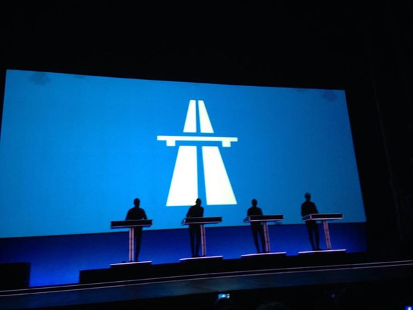
My friend Holger attended a magnificent concert of the German electro band Kraftwerk the other day. Look at their Autobahn image above. That’s what you should throw at the wall when you talk about speed in customer service. That image makes an impact. That image complements your message. That image is beauty and style.

